Impossible color
Impossible colors are colors that do not appear in ordinary visual functioning. Different color theories suggest different hypothetical colors that humans are incapable of perceiving for one reason or another, and fictional colors are routinely created in popular culture. While some such colors have no basis in reality, phenomena such as cone cell fatigue enable colors to be perceived in certain circumstances that would not be otherwise.
The color opponent process is a color theory that states that the human visual system interprets information about color by processing signals from cone and rod cells in an antagonistic manner. The three types of cone cells have some overlap in the wavelengths of light to which they respond, so it is more efficient for the visual system to record differences between the responses of cones, rather than each type of cone's individual response. The opponent color theory suggests that there are three opponent channels:
Responses to one color of an opponent channel are antagonistic to those to the other color, and signals output from a place on the retina can contain one or the other but not both, for each opponent pair.
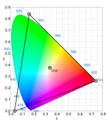
A fictitious color or imaginary color is a point in a color space that corresponds to combinations of cone cell responses in one eye that cannot be produced by the eye in normal circumstances seeing any possible light spectrum.[1] No physical object can have an imaginary color.
The spectral sensitivity curve of medium-wavelength ("M") cone cells overlaps those of short-wavelength ("S") and long-wavelength ("L") cone cells. Light of any wavelength that interacts with M cones also interacts with S or L cones, or both, to some extent. Therefore, no wavelength and no spectral power distribution excites only one sort of cone. If, for example, M cones could be excited alone, this would make the brain see an imaginary color greener than any physically possible green. Such a "hyper-green" color would be in the CIE 1931 color space chromaticity diagram in the blank area above the colored area and between the y-axis and the line x+y=1.
Although they cannot be seen, imaginary colors are often found in the mathematical descriptions that define color spaces.[2]
